Moving Types · Media façade
Messages only came together on the bridge.
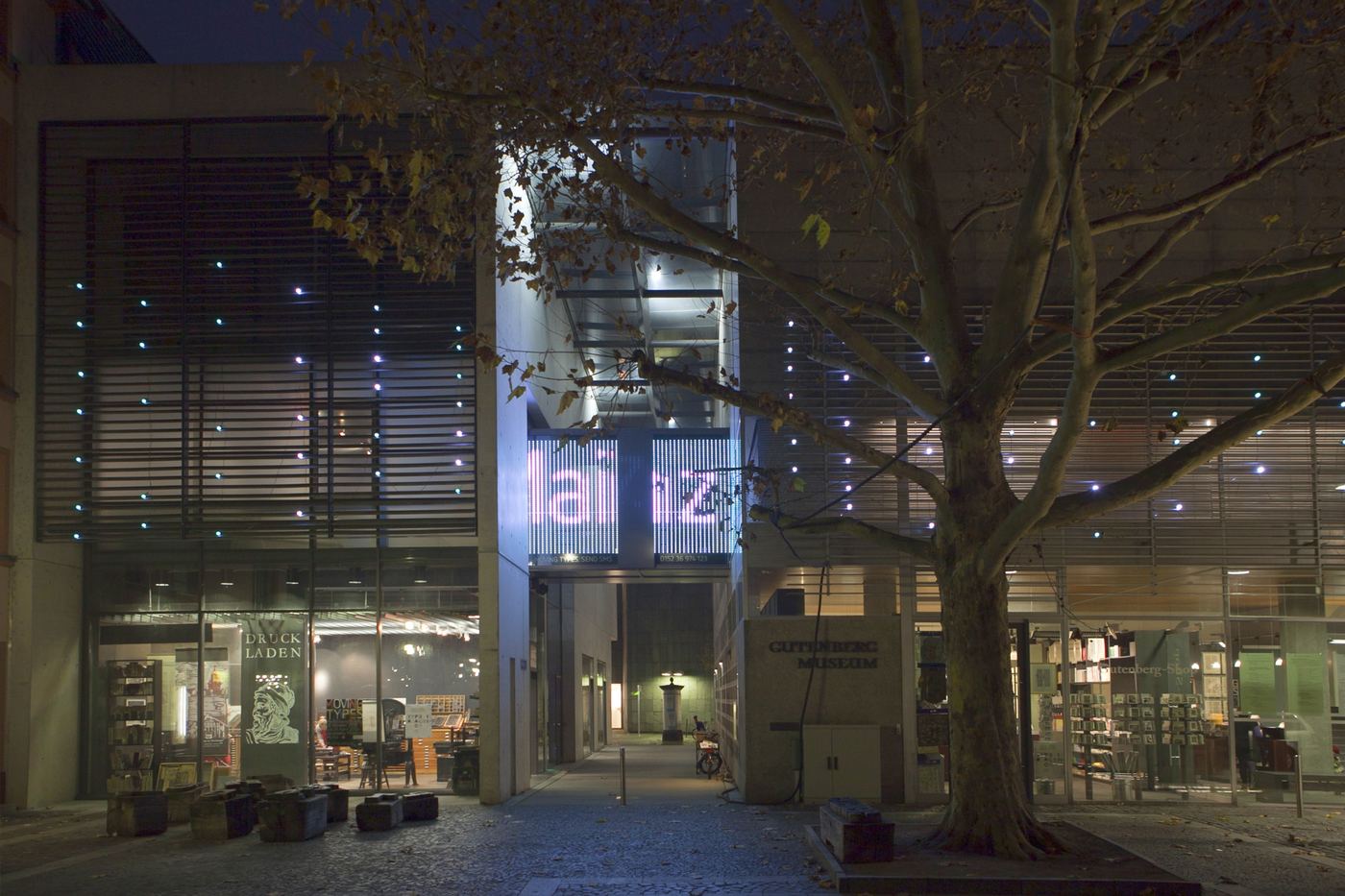
An interactive LED façade for the Gutenberg-Museum Mainz. Anyone could send it a text message. The letters drifted across the building as points of light and became readable for a moment, in one place.
Explore the case- Role
- Concept, technical planning and set-up in a team of three · adapted for three more venues
- Timeframe
- 2011–2014 · in Mainz running until 2024
- Context
- HfG study project for the z zg and the Gutenberg-Museum Mainz
- Status
- Built at four venues · around 3,000 messages in the first six months
The glass bridge in Mainz, 2012 · Still from our documentary film
01 / Starting point
Could a text message become part of a building?
In October 2011 the Gutenberg-Museum Mainz opened ‘Moving Types – Letters in Motion’, an exhibition on a century of animated type. Its first concept, from 2010, imagined text messages projected onto the glass bridge between the museum’s two buildings, so the exhibition would reach the square outside.
In the summer semester of 2011 our interaction design group took on the façade and the entrance. It was a fourth-semester studio at HfG Schwäbisch Gmünd, supervised by Ralf Dringenberg with Anja Stöffler, who curated the exhibition for the z zg, the centre for time-based design of HfG Schwäbisch Gmünd and Hochschule Mainz.
In Mainz I developed the concept, the technical planning and the set-up with my fellow students Luise Pescheck and Adrian Abele, together with Ralf Dringenberg and Anja Stöffler. For the three venues that followed I adapted the façade to each building with Ralf Dringenberg and Anja Stöffler. Nikolaus Völzow wrote the software; Felix Urban composed the sound.
The exhibition and its app are a case study of their own →
“Messages, information, poems or banal greetings can be sent by text message to a large projection (projector or LED screen).”
02 / Site
We started with the square, not the screen.
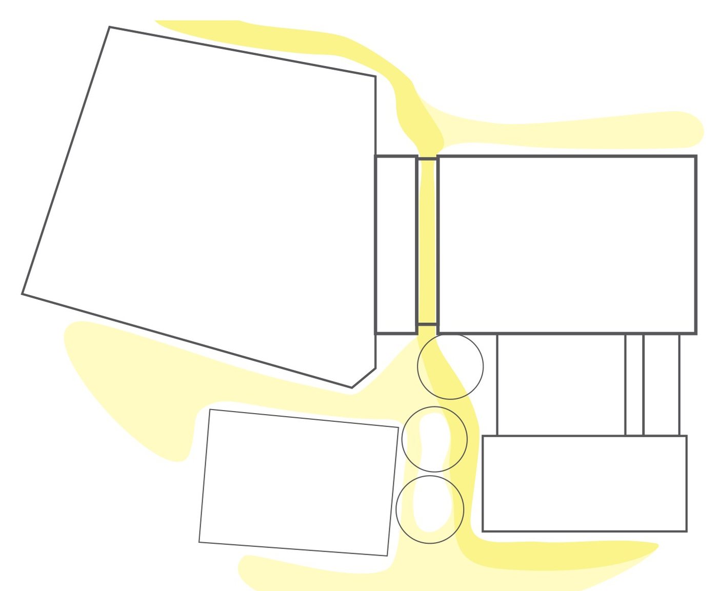
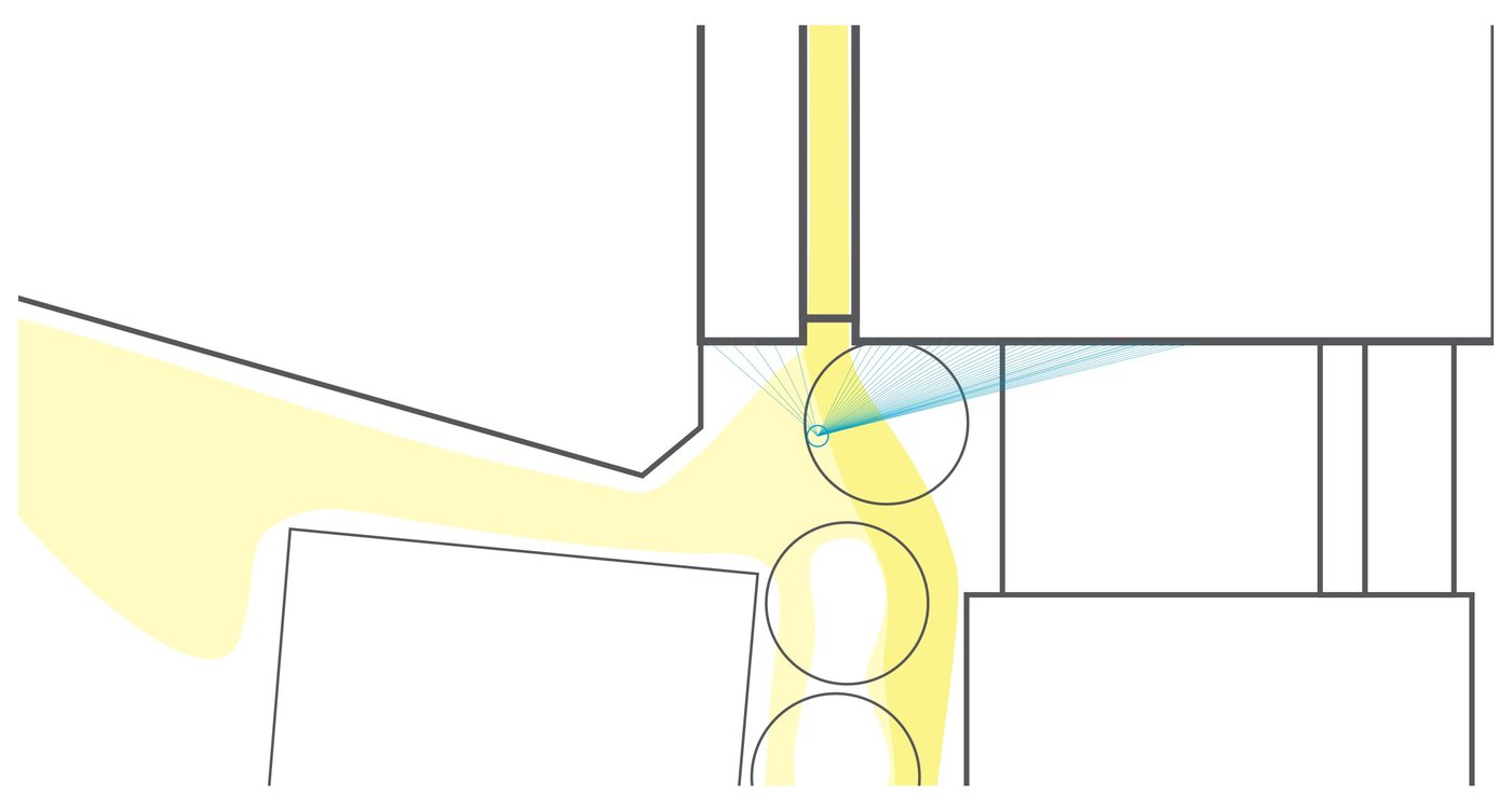
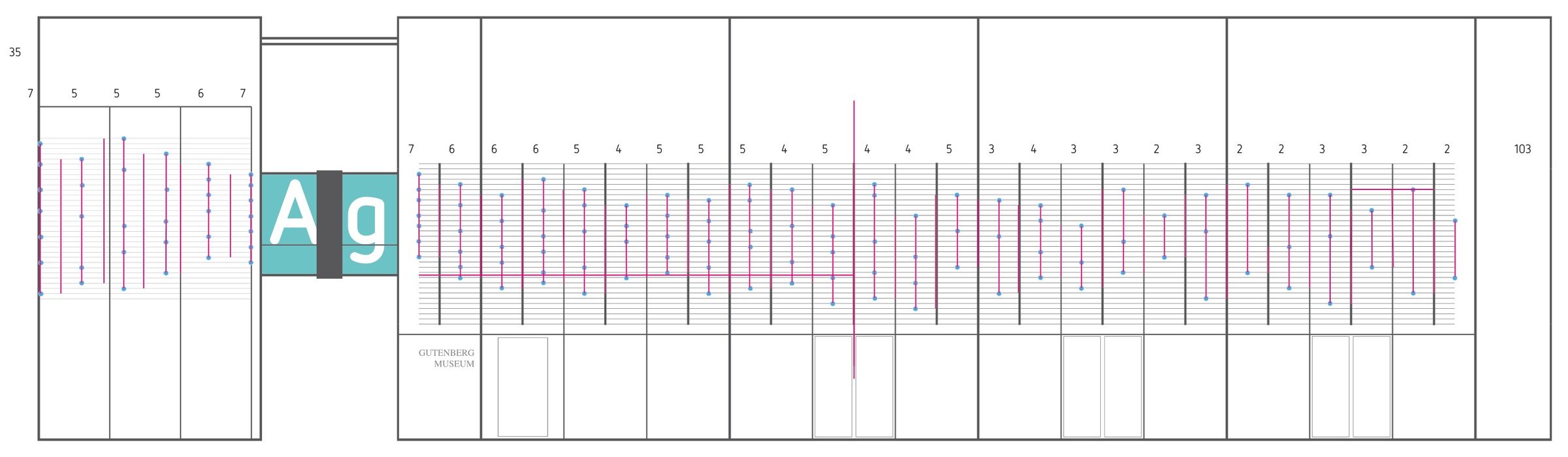
Before choosing any technology we mapped the place: the paths people take across the Liebfrauenplatz, where they stop and from where the bridge above the museum’s passage can be seen. Six steps led from the first concept to a façade that ran day and night.
-
The idea
Text messages on the glass bridge, projected or on an LED screen.
-
Site analysis
Paths across the square, sight lines and the places where people stop.
-
No projection
Daylight, distance and running day and night ruled it out.
-
Vertical LED bars
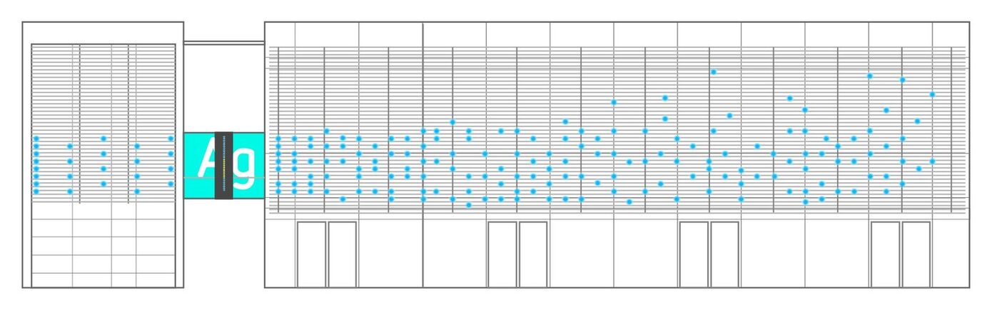
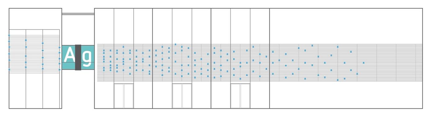
X-Wall bars by Richter: five full-colour LEDs per 21 cm bar, set closer together towards the bridge.
-
Built to fit
Mounting angles calculated, brackets laser-cut from spring steel at the HfG.
-
Opening
The façade runs around the clock.
03 / Encoding
The text was everywhere, but readable in one place.
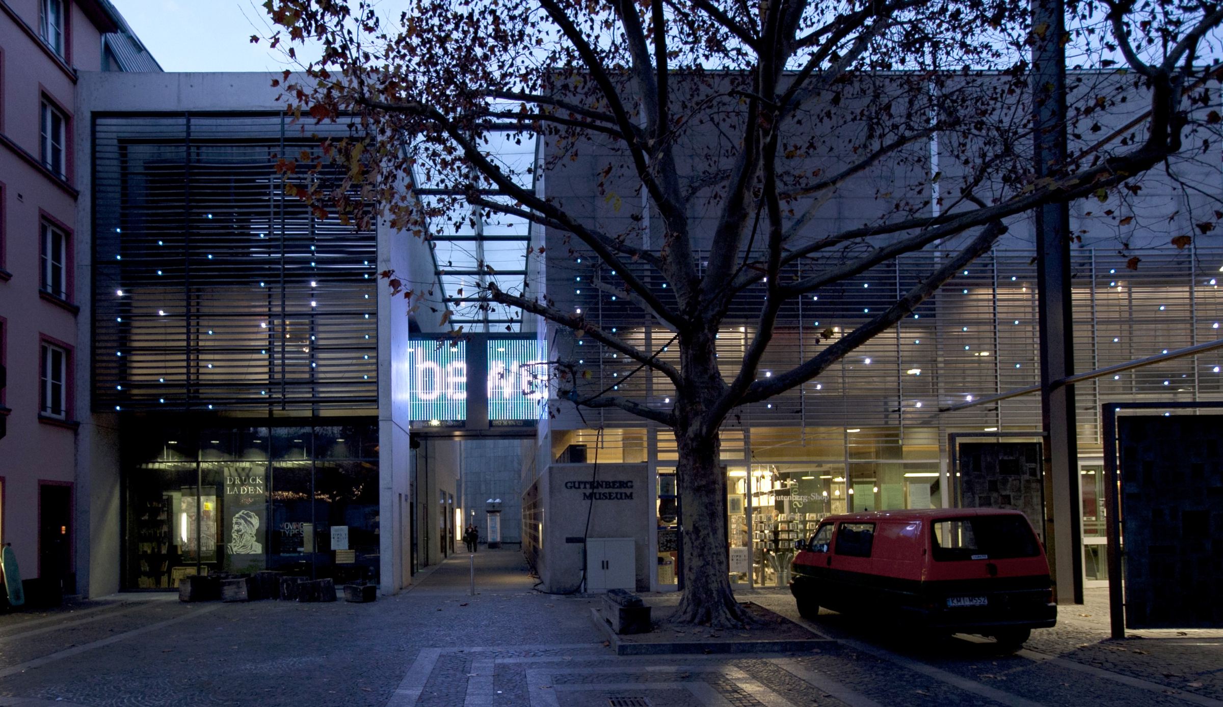
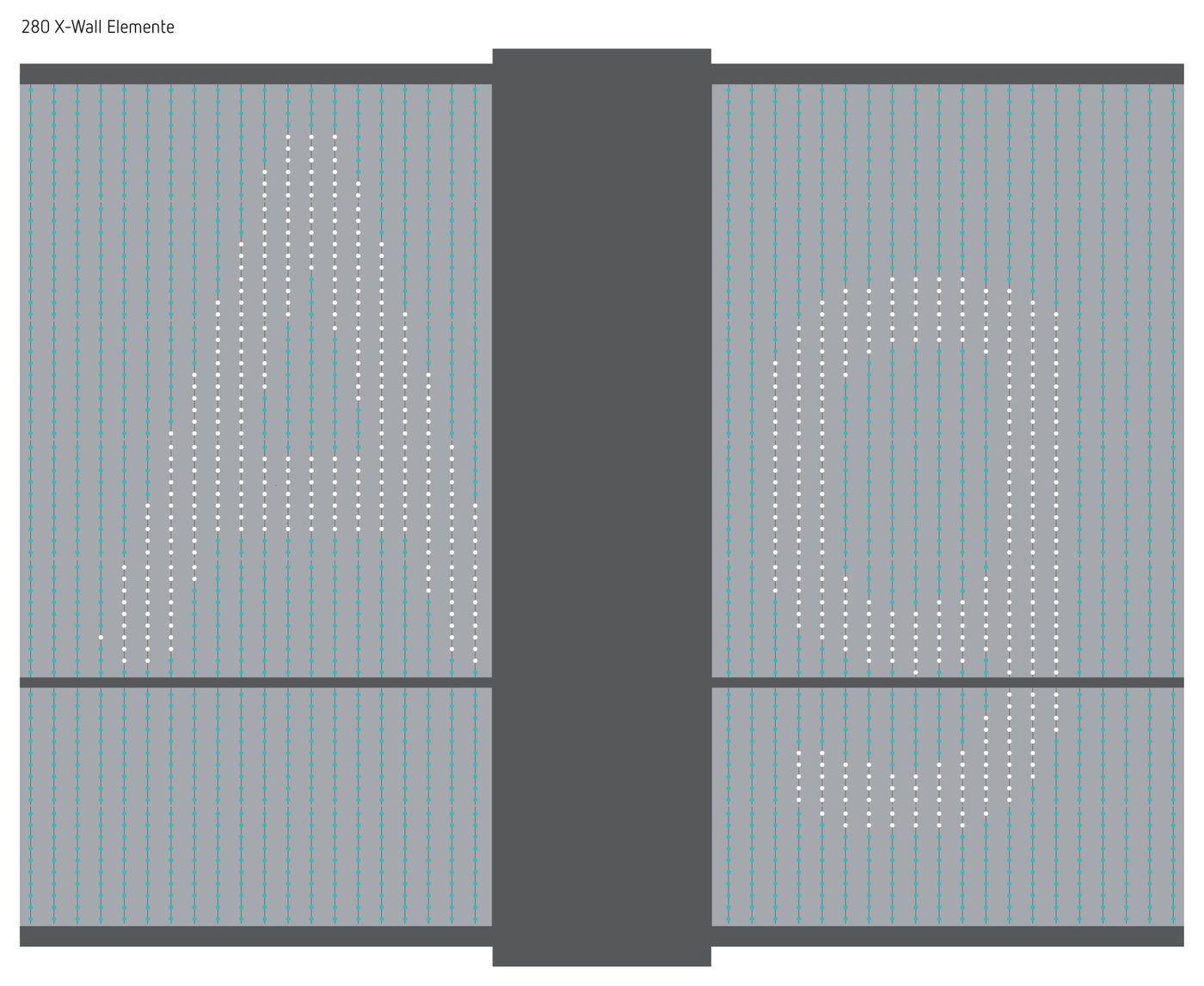
A ticker would have turned the museum into a news board. Instead, each message is broken into points of light and spread over the whole façade, so most of the building shows a drifting pattern. Towards the bridge the bars move closer together. On the bridge they form a dense grid, and the points line up into letters, readable for a moment before they fall apart again. The same idea ran through the exhibition inside, where every film waited behind a code.
04 / Score
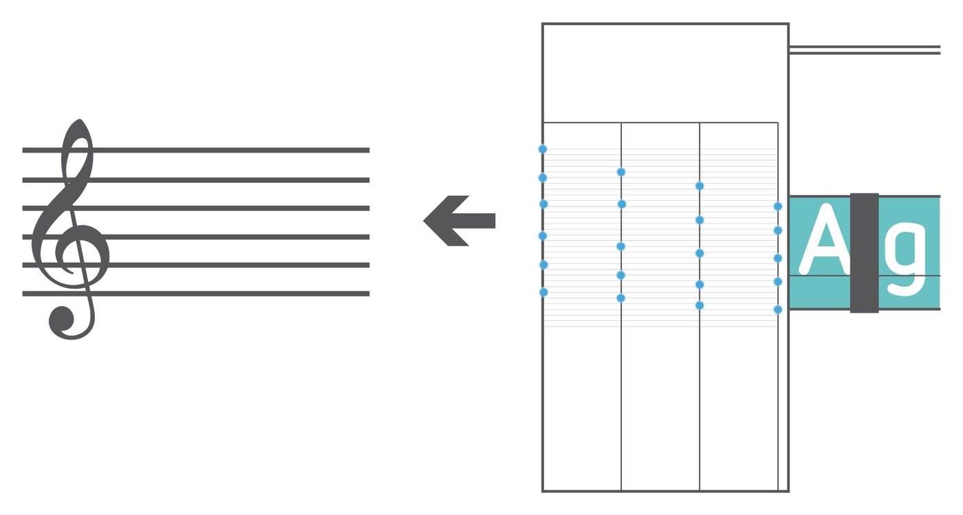
Seven rows of light worked like a stave.
The letters are seven points high, so the façade has seven rows of light, like the lines of a stave. We proposed reading them as music. Felix Urban turned that into a sound concept: every row has its own tone, with three variants for the three LED colours, 21 tones in all. When letters reach the end of the façade, they play a short melody over a quiet ground of paper and typing sounds under the bridge.
The façade also reacted to the people beneath it.
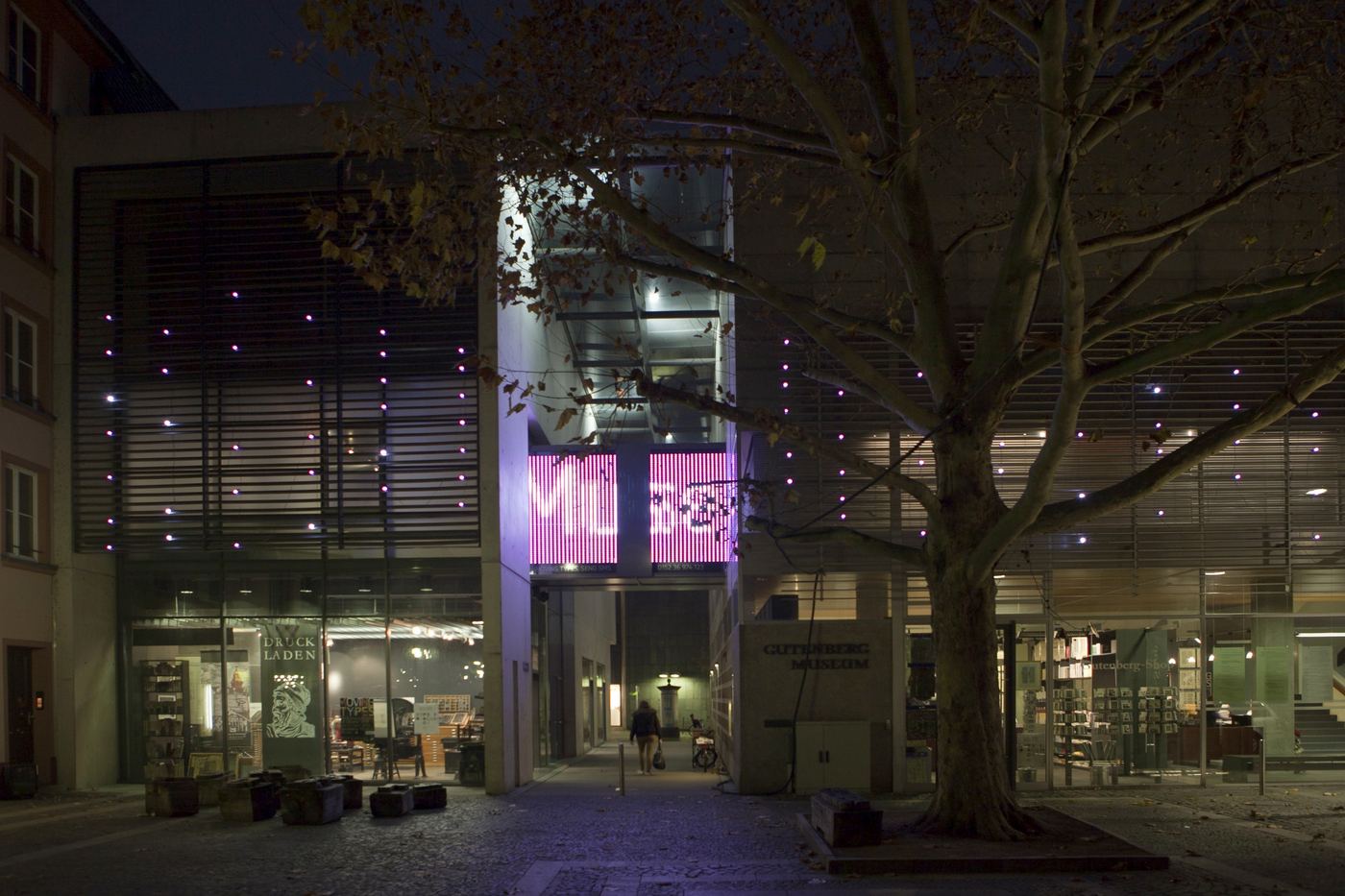
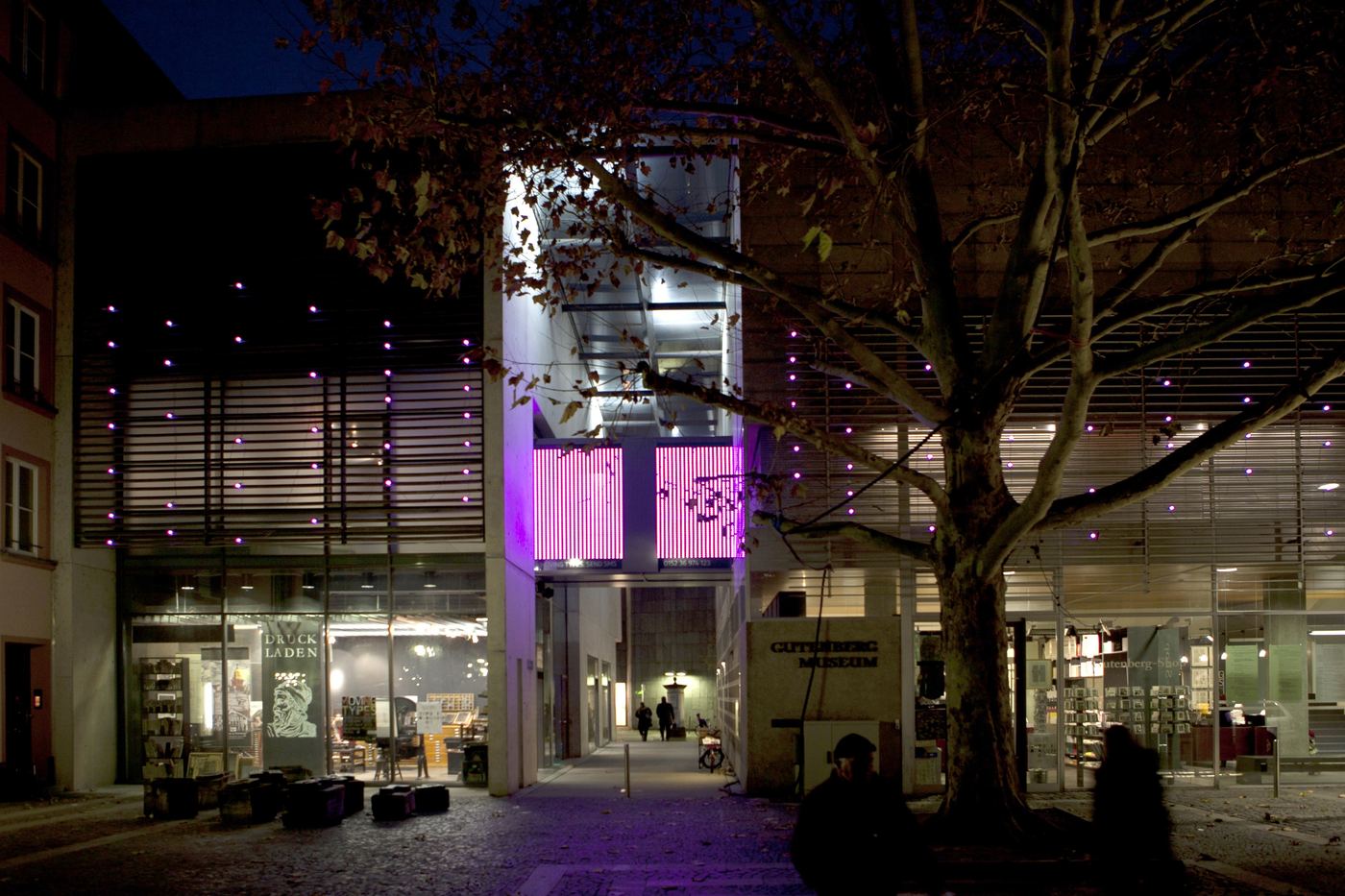
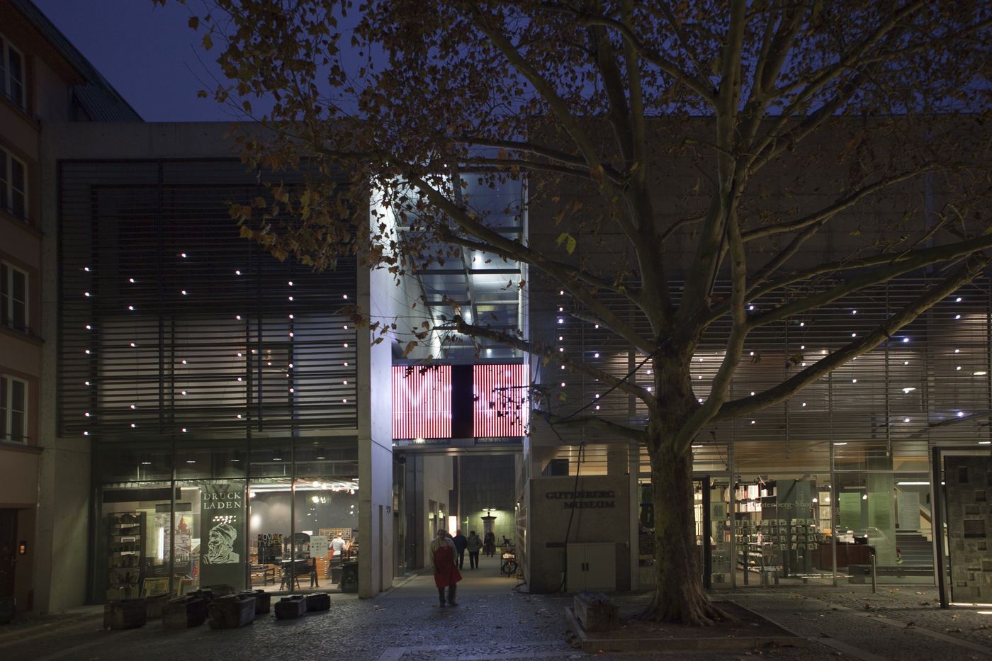
Whoever stood on the bridge distorted the letters. Whoever walked through the passage below changed their colour. Sound, distortion and colour change all ran in daily operation.
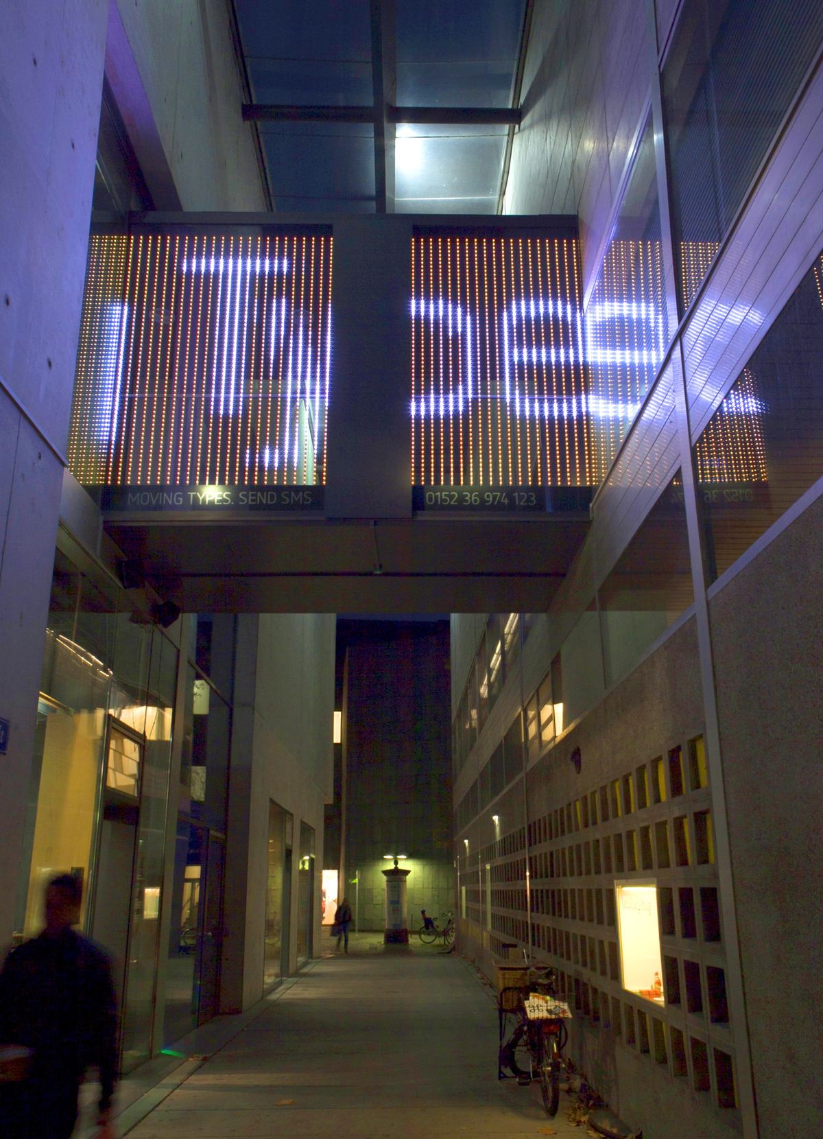
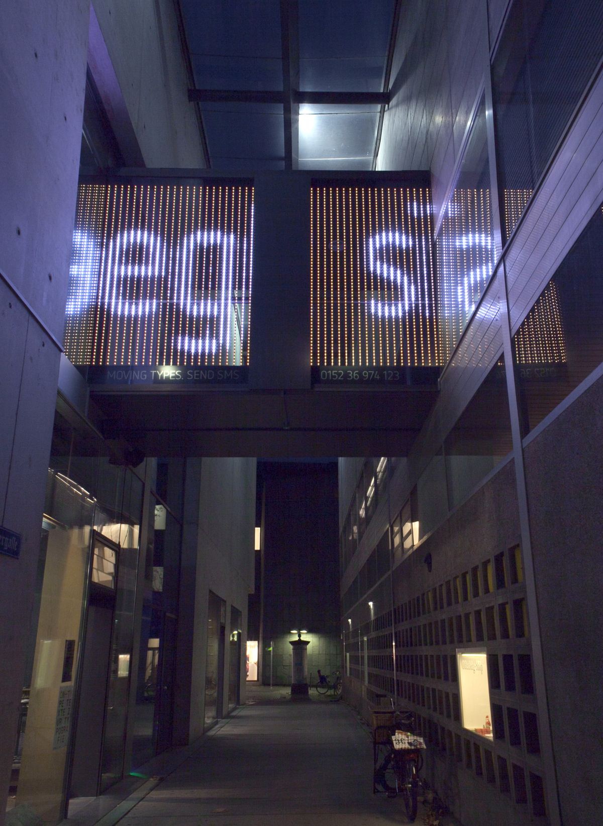
Four photos taken from the same spot show the colours the letters took on the bridge. Walking through the passage below was one way to change them.
05 / Build
We rehearsed the façade on a white model.
Before anything was mounted, we tested the animations on a white model of the façade: a concept video in May, projections onto the model in June. Then came the building work. We calculated the mounting angles, laser-cut brackets for the bars from spring steel in the HfG workshop and planned the cabling. The façade opened with the exhibition on 20 October 2011 and ran around the clock.
From the model to the real bridge.
A few weeks after the opening the letters ran over the glass bridge as planned: dense enough to read, scattered again on either side.
Type a message, look up, wait for the bridge.
Our documentary film shows the façade in use. In June 2012 a school competition, ‘SMS an Gutenberg’ (text messages to Gutenberg), sent its entries to the façade during the Johannisnacht festival.
-
Send
Any phone could write on the museum.
From our documentary film, Mainz 2012. · Original material
-
Look up
On the square in front of the museum, people looked up at the façade.
From our documentary film, Mainz 2012. · Original material
-
Read on the bridge
The points come together on the glass bridge, here as ‘Gutenberg-Museum’ above the passage.
From our documentary film, Mainz 2012. · Original material
06 / Four venues
One idea, adapted to four buildings.
The exhibition travelled, and each venue got a façade of its own, built from the same parts: text messages as input, X-Wall bars and Nikolaus Völzow’s software. Ralf Dringenberg, Anja Stöffler and I adapted it to each building. These were simpler set-ups than Mainz, which remained the conceptual core.
-
Gutenberg-Museum, Mainz
2011–2024. A long façade and a glass bridge. The message turns into text only on the bridge.
-
Galerie im Prediger, Schwäbisch Gmünd
Sep–Nov 2012. Five windows of the former monastery, facing the street.
-
Dortmunder U
Sep 2013 – Mar 2014. The window of the ‘Lautsprecher’ (loudspeaker) on level 4: 368 bars, with a hashtag code.
-
Alte Post, Schwäbisch Gmünd
Apr–Oct 2014. LED bars in the glazed stairwell of the HfG building.
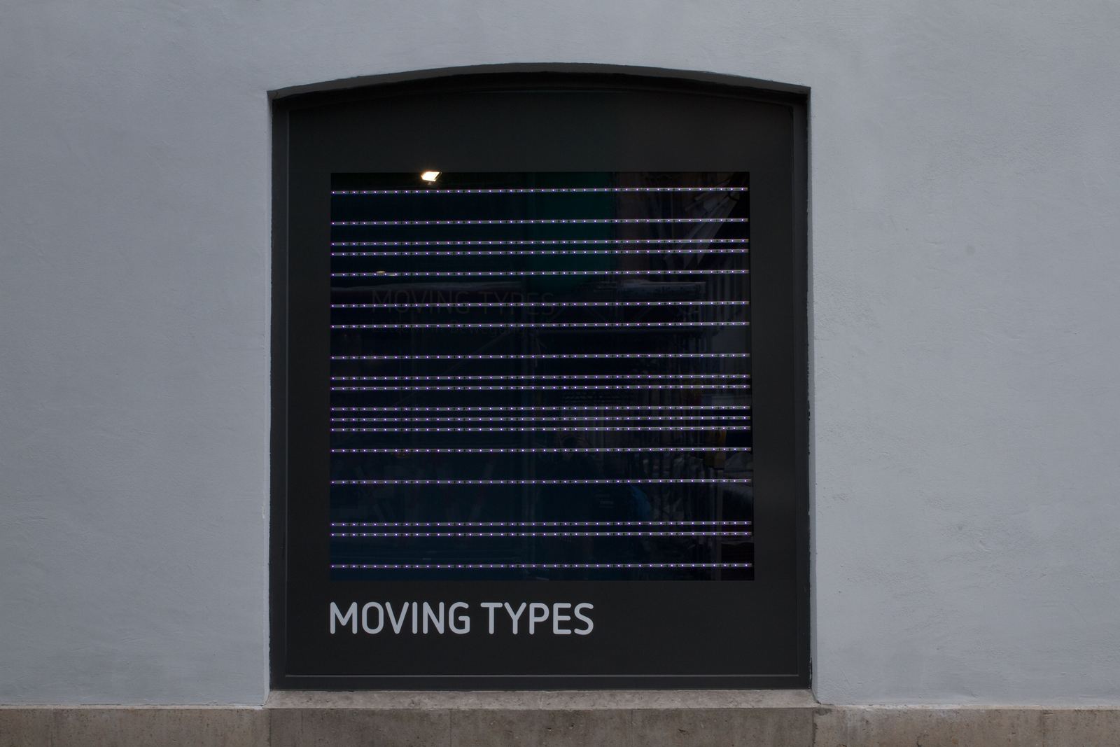
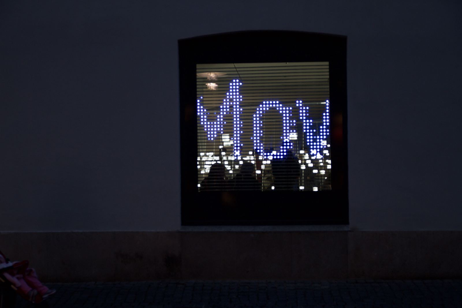
In Dortmund, passers-by set the typography.
A hashtag and five digits at the start of a message changed how it appeared: background colour, text colour, size, speed and letter spacing. Zero left the choice to chance.
The colours ran from 1 to 9: white, red, green, blue, yellow, violet, orange, turquoise and black. Size, speed and spacing went from – – – – to + + + +, with 5 as standard.
- 2Backgroundred
- 1Text colourwhite
- 8Size+ + +
- 5Speedstandard
- 0Spacingrandom
07 / What remains
The façade outlived the exhibition by more than a decade.
In Mainz from October 2011 until 2024, with around 3,000 messages in the first six months, tests included. Three more façades followed in Schwäbisch Gmünd and Dortmund, 2012–2014.
Reflection
Making reading depend on a place was the strongest decision and the riskiest: from most of the square, the façade read as a pattern, not as text. What I would do differently: test the reading moment on site at night, earlier, and give the rest of the façade a cue that leads the eye to the bridge.
- Team, Mainz 2011
- Dominik Witzke, Luise Pescheck, Adrian Abele · concept, technical planning and set-up
- With
- Prof. Ralf Dringenberg, Prof. Anja Stöffler · z zg, HfG Schwäbisch Gmünd and Hochschule Mainz · later façades together with Dominik Witzke
- Software · sound · LEDs
- Nikolaus Völzow · Felix Urban · Richter lighting technologies (sponsor)
- Film and photos
- Documentary film 2012: Onofrio Di Franco, Adrian Jehle, Marcel Müller, Dominik Witzke · Photos: Martina Pipprich (Mainz, 2011), Dominik Witzke / Adrian Jehle (Galerie im Prediger, 2012)